
Magic of 3D Cards
Software engineering is full of little discoveries. It is the closest thing in real life which could be correlated to the trope mage fantasy in DnD realms; whereby a mage can find seemingly endless tomes of ancient wisdom, then utilize that wisdom to alter the world or perhaps create something legendary.
Gamedev is certainly software engineering, yet crossed into many multiple other disciplines. One must "multi-class" if there is a hope to overcome the challenges and "bosses" along the way. One of those cross disciplines is (user interface) UI design, which later "digivolves" to (user experience) UX design.
Glitter
Shiny things are fun. UI design could be thought of as making something shiny for the glam looks. Dribble has perhaps thousands of sweet fake little UI designs that look so tantalizing, you just wanna go and build it. Here is the thing though. The experience of using those oh so sweet pure UI designs aren't enough to actually get something usable by humans. A golden apple isn't edible, but it looks wonderful.
Chefs manage to create beautiful works of art on a plate that are packed with visual glam, carbs, fats, proteins and other goodness. In the culinary discipline, people find a way to balance visual appeal with functional use. There is a similar mastery going on here with web development as well as game development.
Needless Obsession?
What's wrong with something that "just works", or just "gets the job done"? Probably nothing, yet I also am not drawn to those things. There is nothing in me that desires a bland experience when gaming. My days of spider solitaire on my mom's windows 95 toaster are over!
Card games have been such a deep part of my gaming experience; I hadn't really realized that card design was a hidden obsession. I collect all varieties of cards both physical and digital; now we can talk about some inspiration from these, and how it has driven the course of SteelPinion's own cards.
Hearthstone
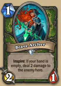
Look at how beautiful that card is! Okay so it has 3 major numbers capturing cost, attack, and health. Hearthstone's core is a very simple game, yet becomes wild quickly due to its engine's flexible rules. Each card can alter how a turn or action will behave; then mixing and matching these cards creates unique experiences.
It is up to the player to read the description and interpret the meaning and value of the card in question. The designers of this card are brilliant and helpful because interacting with it via hover offers all kinds of support information (such as the definition of inspire).
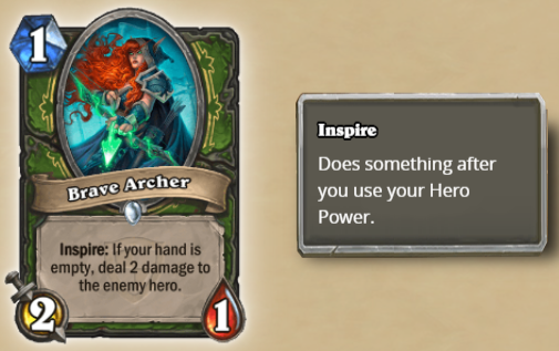
Complexity in hearthstone is captured or trapped in the card's descriptions. They take a single word, bold it, and pack it with function. The pattern employed here trains players on the game's vocabulary. It is hard to forget rules, when each card is it's own little encyclopedia.
Hiding Important Details
Since SteelPinion is fundamentally more complex than hearthstone, it has more information to fit into the same space. This has been a big problem on the project of my own making that other tactical strategy games don't have because they don't insist on using a card centric interface.
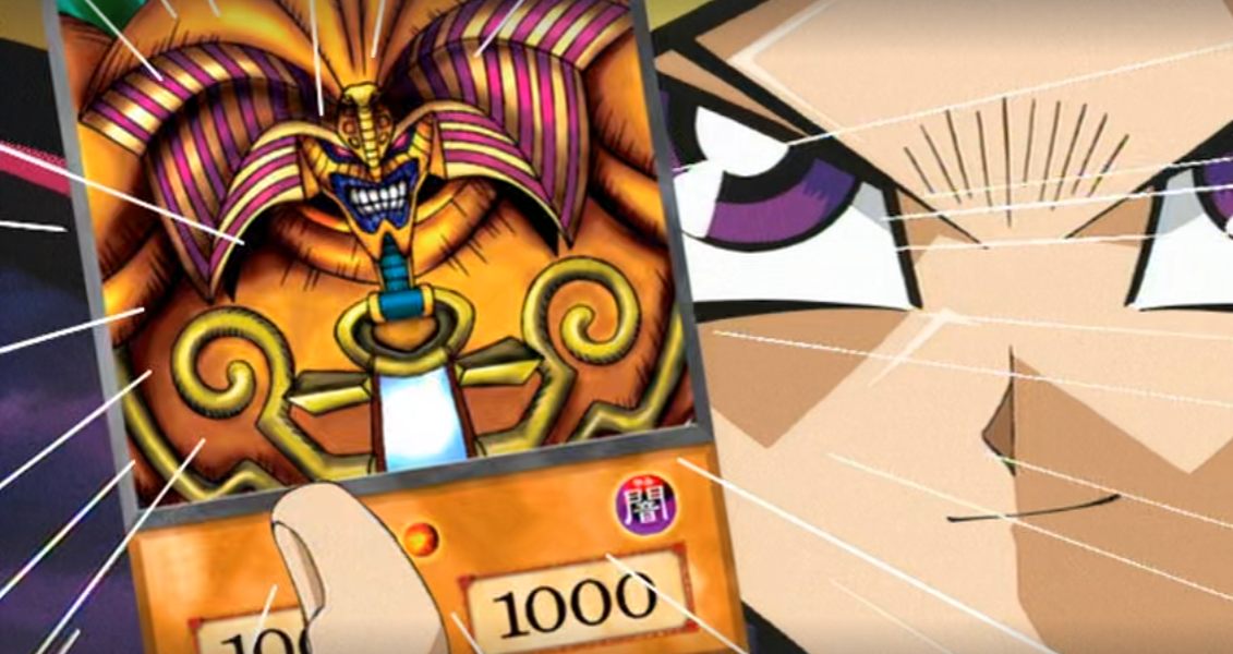
Complex card games like Yu-gi-oh simply hide all knowledge of the cards in the anime itself. I'm about to make an unfair comparison, but this example makes it easy to drive the point regarding game makers hiding information due to design/experience difficulties.
Several games have hidden statistics that alter the behavior of the game, yet are inaccessible to players. Infamous hidden stats in Pokemon games called "IVs & EVs" are crucial for determining the full potential of a given Pokemon. One of these numbers is determined when a Pokemon is instantiated, while the other can be manipulated by the player.
The game makers of Pokemon, like the anime makers of Yu-gi-oh, decided that it was not crucial information required for the experience they wanted to create for players and viewers respectively. I do think these decisions were good for obvious reasons on the Yu-gi-oh anime. Additionally, the Pokemon game makers made a decent call providing some sense of randomness in the growth progression.
Still, some players want to see the nitty gritty, and not providing a way to dig into the hidden stats is a disservice to strategy loving nerds.
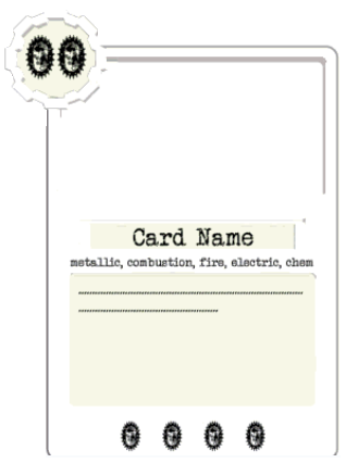
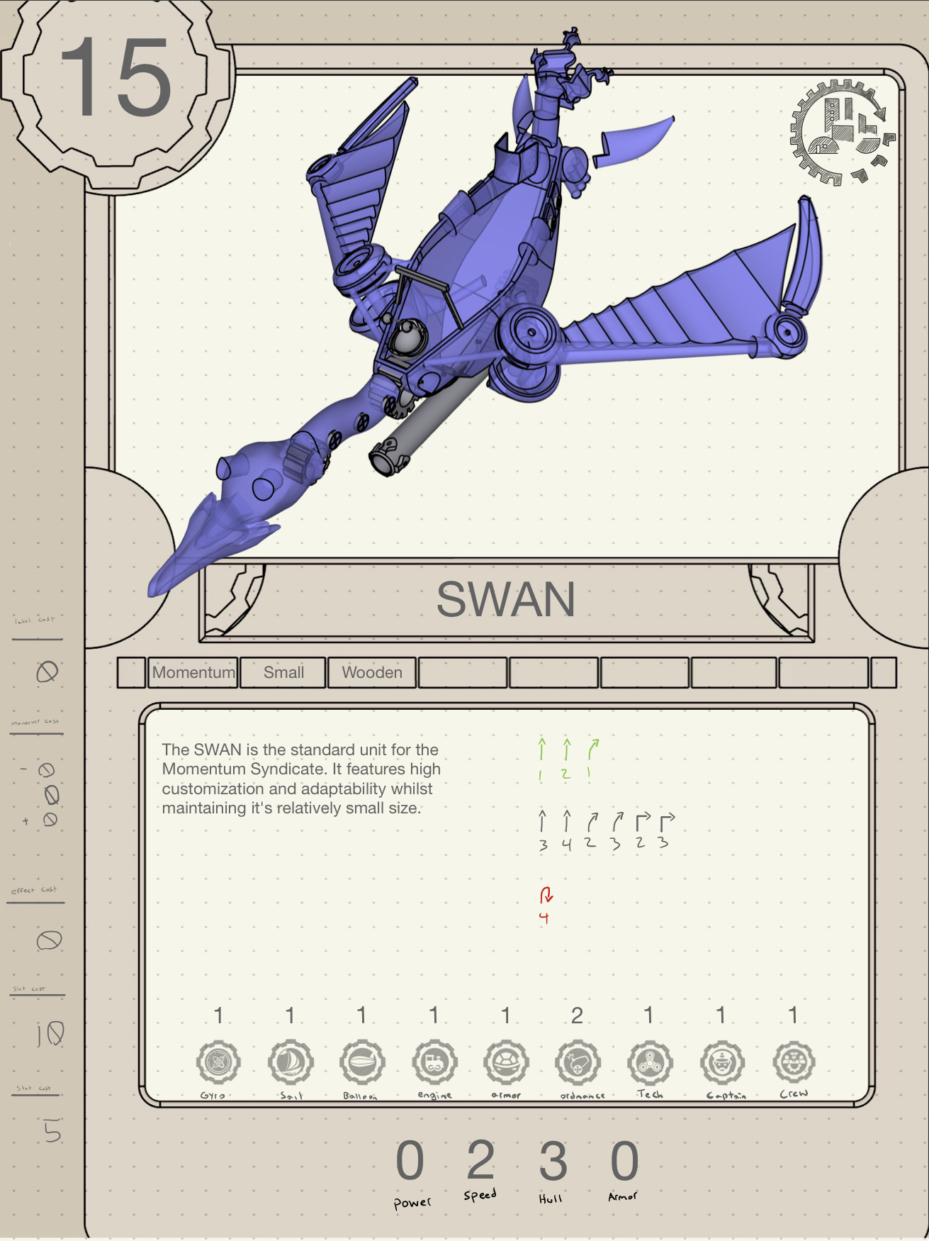
First Card Version
This was the first version of the card. It has a similar philosophy as so many other collectible cards, but already we have a ton of information in the mock that isn't always needed right away. The four numbers on bottom were meant to capture (from left to right) the attack, evasion, health, armor.
Turns out that not all cards have the respec function, which represents a simple base stat change to a ship in Steelpinion. The respec function ended up being so powerful, we scaled it back to less cards. When we did that, the four numbers on the bottom were almost always zero; that ended up looking really dumb for any other non-ship card.
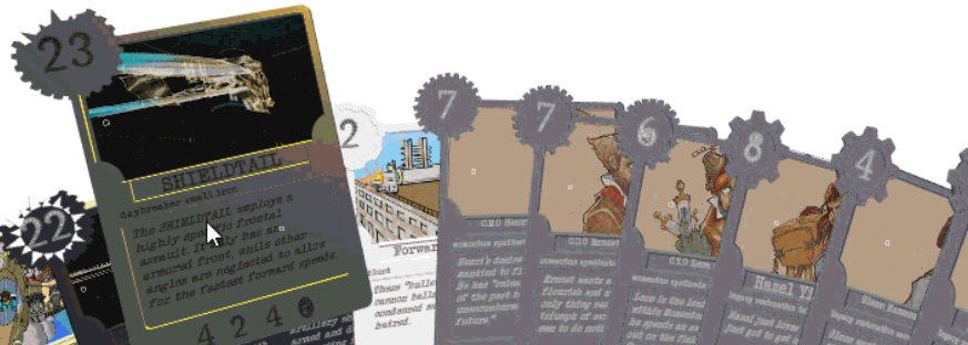
Second Card Version
The next version expresses a desire to get into 3d effects whilst also containing all the information a player might ever need.
This was legible on my goodnotes app, but not so great for reading in real life since the text had to be super tiny in order to fit. To combat this, I drew up some icons that would hopefully allow us to avoid making a bunch of illegible text. As we can see, that alone doesn't actually help with the information overload problem, nor legibility. If icons are too small, then we are back at square one.
Unity Experiments
Wanting to see what it felt like filled out, I constructed some cards in unity (our game engine at the time a couple years ago).
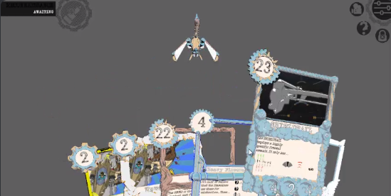
While we were all really excited about the unity 3d card experiments. We ran into framerate issues when needing complex 3d menus. Unity's performance did not shine here. It was clear that we would need to rely on mostly 2d renderings for performance gains, and create a kind of 3d effect akin to what is done with marvel snap.
Web Experiments
Web development is my bread-n-butter. I went back to my comfort zone for a little bit to see if I could create performance optimized cards.
Making these was super fun! We plan to use them more throughout the site as we establish more cards and mods for the game. Since the game engine is headless, making a light web client is certainly within the realm of possibility someday.
Unreal Experiments
These are still a work in progress, but I've been sharing more of where we are instead of waiting for the full polish.
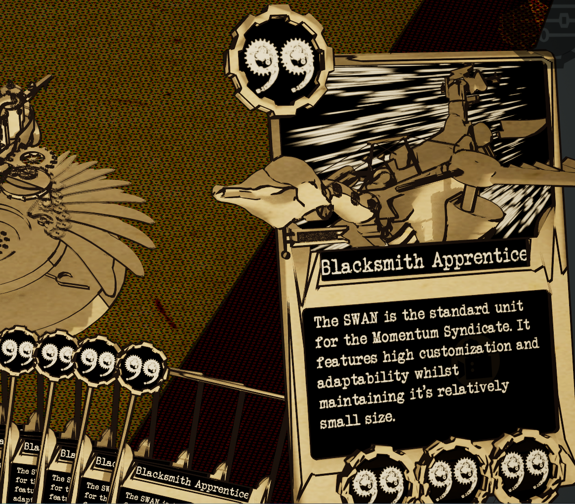
We want to test the max text length available on the card, which is currently ~21 without making dynamic font size alterations. This is also why "99" is all over the place. Two diget numbers are a known maximum in this stats system.
The cards feel good in the Unreal Engine. Thanks to their 3d widget system, we evade the 3d menu complexities! Finally thanks to nanite, we can actually have 3d protrusions akin to what we had in the web version! WOW! Having fun with Unreal now.
Closing Thoughts
There were more inspirations like yu-gi-oh, pokemon, magic the gathering, dragon ball z, naruto, marvel snap... Alas, I must draw this article to a close to go back and work on the game itself! We look forward to introducing another neat design into the world which can be both beautiful and functional.